How To Pick the Best Grantmaking Solution for Your Nonprofit
After 15 years, foundationConnect is going away. Here are three top nonprofit grantmaking solutions for your organization to consider — and how to choose the right one.
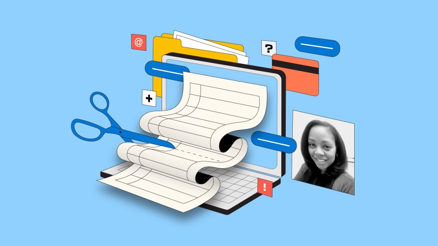
Do Your User Record Pages Have Too Many Fields? Dynamic Components Can Help

If you have too many fields, remove duplicates and use component visibility rules.
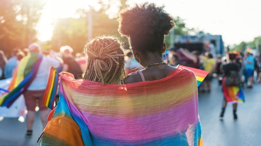
How to Support LGBTQ+ Communities During Transgender Awareness Week and Beyond

During Transgender Awareness Week, we’re taking time to recognize where we’ve been, where we are, and how to create a more equal future.

4 Ways Design Helps Fundraise for Your Nonprofit

Engaging donors is nuanced work. Your technology tools should make it easier.

Impact Management: Measuring, Evaluating, and Maximizing Impact at Your Nonprofit

The rate of innovation and advancement in technologies has been extraordinary over the past year, and organizations of all shapes and sizes need to keep pace. Demonstrating impact, an essential part of any…

AI Tools Can Help Your Nonprofit CRM Work Better — Here’s How
Organizations are building AI and data into their nonprofit CRM strategies to scale impact and better serve partners, donors, and clients. Here’s how it works.
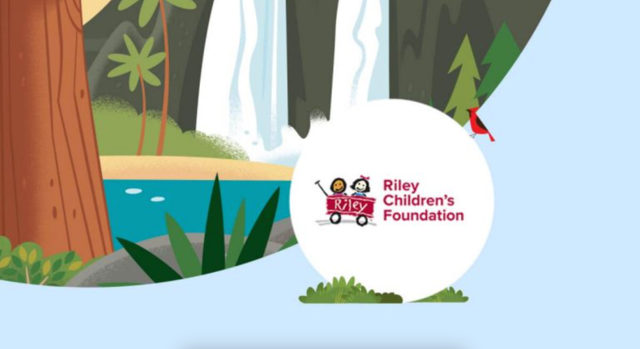
How Nonprofits Can Boost Efficiency With AI-Driven Insights
Riley Children's Foundation boosts fundraising with actionable insights.
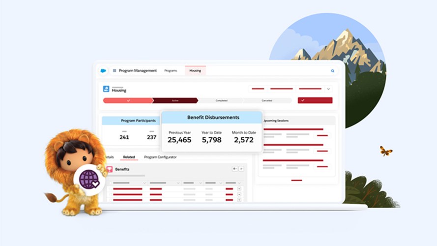
Salesforce’s New Nonprofit Cloud: Uniting Programs, Fundraising, Engagement, and Outcomes for Greater Impact
Technology doesn’t distribute supplies in a disaster or ensure everyone has access to fundamental rights—humans do those things. Big or small, nonprofits work alongside individuals, partner organizations, government agencies, healthcare providers, volunteers, and…

7 Ways to Honor Dr. King’s Legacy on Martin Luther King, Jr. Day
*This post was originally published on January 20, 2020. It was updated and republished on January 16, 2023. Today is Martin Luther King, Jr. Day. What’s the purpose? To begin your week, and…